Wednesday, 19 December 2012

Colour Theme

This is the front cover of my theme 'Colour'
We all see colour through our eyes so I decided to make a piece with a colourful eye. I used water colour pencils and pastels and a pencil. The drawing didn't turn out as well as I thought it would've but it's not too bad I guess.
 I thought if the dib and dab technique so I decided to try it out with acrylic paints. I wanted to paint something simple enough for me to sucessfully create a nice outcome easily so I picked the Eiffel Tower. This technique looks pretty good, I think I'll use it again in future projects.
This idea I got from one of my cousins. I used colored card and weaved them together to make these patterns. I used multiple colours to link it with the theme. The square piece turned out nicely but then I tried to make it a little bit more interesting to so I made a star shape, but this didn't work out as good as I hoped for.


I made the piece on the right from dripping the coloured ink from the left piece into the sink. I saw this nice abstract effect so I decided to take a pic and edit it on photoshop to produce different effects. It was just by luck that I created such a beautiful abstract, I didn't intententionally want this.

This in inspired by an artist called Iain Andrews. This artist has beautiful works of colour and detail which had a sort of melty effect to it so I tried to create my own version. I used acrylic paints mixed with water for the melty effect, the painting is meant to look like a fire breathing dragon.
This is my collage print. I created a patternt out of card and then used green ink to print it with. I then used coloured pencils to fill in the white space because it looked unfinished. I can say the added colour has given it that extra oomph of improvement.
I also created a Lino print but this time i printed it a little differently to see what effect it would make. I used 3 different coloured and printed them just beside each other to get this nice distorted look. I like how it turned out because the colours go very well together.

 
I also created a couple embossing prints as sample pieces. I used water colours for the one on the left and drawing inks on the one on the right. I had to make a second one because the first one didn't print too well because the paper was too thin. I learnt that thick paper is needed for this kind of print so I changed paper for the second print.

I had to do some mark making. I wanted to use dark colours instead of the usual bright colours that I've been using so I have a different variety of colour. This was just all experimental work, I tried out all kinds of materials. This was my first time using the wax pot which was very interesting and new to me.
This is a technique that I've used once before in high school. It was a nice technique so I wanted to try it agian but this time with multiple colours to link it with the theme. I like the abstract look and brightness of this piece, it gives off a happy kind of mood to me. I used black biro, water colours and a touch of white paint.
 
This is the biggest piece that I've done so far for this project. It was created with soft pastels, drawing inks, paints, pro markers and coloured pencils. I felt like using all of the colourful media that I had to create a vibrant colourful piece of work. It gives off a nice and happy feeling which was what i wanted to do.
This piece is just experimetation. All the colour that I used for this piece are all from coloured tissue paper. I found out this idea of wetting tissue paper and then squeezing the ink out onto the page. I just splashed the colour everywhere to see how it would turn out.
 
I have decided that this would be my final piece for this theme. It is a forest type of scenery, I created a contrast from pencil to colour to show the difference in media. Colour brings things to life whereas pencil looks a little dull. I used pencil, water colours and coloured pencils to create this art work. I am happy with how it turned out, it could've been worse. The only down side I have to this piece is that It doesn't look too much like a forest because you can only see three trees but overall I think it's still awesome.
 

Tuesday, 18 December 2012

UCAS Trip

I also visited the GMX centre in Manchester to get a look at what kind of universites there are. I had recieved a good variety of prospectuses and information from the universites that I was interested in. I now have a better understanding of which universities I would like to go to.

Visit to the museum

A few weeks ago I visited the Warrington Museum and looked at all the different kinds of artwork on display. I was hoping to find some new inspiration for my project. My theme was colour so I took photographs of anything that looked colourful to me. Some of the things I saw were quite interesting especially the things in the animal room. I only found one artist whose works seemed like it would link perfectly to my theme of colour and this artist's name is Iain Andrews.

Finding your direction

This is the third project of my foundation year. I have to pick 2 different themes from the list that was given to me to base my work around. I am too work on one theme for the first three weeks and the second theme for the next 3 weeks. I am already in my third week so far and my work is going well. I have chosen my first theme which is 'Colour', i chose this because it seemed like a really good theme where I can experiment fully with lots of fdiffernt materials in an easy and fun way. I have still not decided what my second theme is, I will think about it over the Christmas holidays but so far I think I am doing a good job on the Colour theme.

Monday, 26 November 2012

Their Theory Your Practice

Their Theory Your Practice is the titel of my second project. I have look at different artists who inspire and influences me and on my work. I am asked to do a 2000 word essay on my specialsim in art and to produce a 5 minute presentation which I've already done as well as 4 post card sized final pieces of work.
This is my first final piece. It's an attempt at a graffiti styled piece of art. Graffiti has always looked cool and funky to me and so I just wanted to have a try. I used photoshop because I wouldnt know where to start if I used spray paints plus it would be very messy. I also added a little manga drawing just to add a little of my style to the piece and I think it fits in perfectly.

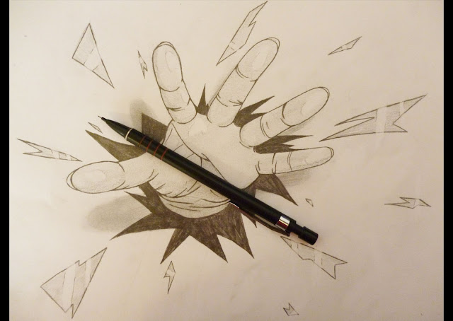
This is my second final piece. It's a 3D type drawing where the hand is meant to look like it's coming out of the page. This was inspired by an artist on Deviant Art named Ramon Bruin. He creates many drawings such as these and does it skillfully. This drawing is actually my second attempt at this style, the first one didn't turn out too well but I'm happy with this one. I tried to make it look as if the hand is reaching out for the pencil for a cool optical effect.

This was inspired by another artis from the Deviant Art website. I saw one of this artist's picture where he combined a real life photo with a digital character placed inside. I thought this was a very creative idea so I tried it out for myself. I took a picture of the ringed benches at college and digitally created a cartoon octopus using Photoshop.

This is my fourth and final piece. This was inspred by an artist named Yulia Brodskaya who is very skilled in drawing, graphic design and typography but what caught my eye was her paper graphc skills. She swirls coloured strips of paper and sticks them together to create amazing and stunningly beautiful pieces of artwork. When I saw her works I thought "wow, thats cool" so then I really wanted to try this technique as well. I thought it would be a nice new thing to learn and since I usually stick to 2D work, this was a great skill to get me into the 3D side of thngs.

This is just a potential final piece that was inspired again by Ramon Bruin. I tried to make the bird look as if it was popping ut of the page and I tried to make it look as if I was holding the feather. I didn't include this as my final piece because I posted both this and the hand picture on Deviant art and most people like the hand picture better so left this one aside. I still think this looks pretty awesome though.

Presentation

I've finally gotten through my presentation on manga, yay! I'm glad it's over, now I have nothing else to worry about which is a huge relief. Even though there was a little slip up with the recording not working on first slide, I think it still went really well. I hope no more presentations will come up in the future briefs.

Life drawing


These are my life drawings from the first week. I'm finding it quite difficult but hopefully I will improve as the weeks go by. I'm probably not good at this type of drawing because I don't really like working in a time limit but I will try my best anyways to get used to it.

Super Post

Super Post! I know I haven't been updating as frequently as I should be so here's a big update to try and make up for it. These are some of my works from my first project.
This is a chibi sty;ed manga drawing of myself. I did a normal styled of myslef first so I thought it would be cool to try out a chibi version too and I think it turned out really well.


These 3 drawing are all of me in manga style. I drew each one seperately and then ;ayered them together using photoshop. I wanted to see how this technique would turn out and this is what I got.

Me again, in black biro. The paper that I drew on are foure seperate rubbings of surfaces that I found around the college.

 
This is meant to be as well, I used wire and twisted them together to create this face. It was pretty tough to do as the wire kept hurting my hands more and more gradually. I still think that it's a pretty good technique to use though.

 This is a contour drawing of my hand. It is a more precise control drawing that I usually do. My first attempt on this was ok but it was more rushed, this one I think is better.


A big drawing of my eye on A1 paper.

For this drawing I found an artist on a website called Deviant Art whose works inspred me to draw this picture. I used watercolours pen and coloured pencils just like the artist who inspred me. The artist's username on wwebsite is Nanohikakou.

This is a still life painting. I'm usually not very good at painting so this was quite challenging. I had to mix colours to get the right colour of the object that I was drawing which I was not so good at. Overall, I think it's ok for a first attempt.

This is just a logo I made digitally on photoshop. It's a tribal star design and the chinese characters in the middle is my name.

Tuesday, 2 October 2012

Random objects


One of the first things that I did for this project was draw from primary sources. I picked random objects that I found lying around the house and drew from them using different types of media. The first two drawings were drawn with charcoal, im not so good with them as you can probably tell but it was good practice anyways. The second drawing is done in pencil, it is just a turtle necklace that I found in my cabinet full of trinkets. The large drawing is a 4 way split drawing on A1 paper. the first drawing was done in pencil, the top right hand drawing was done in pro markers, the bottom left was done in fineliner pens and the last one was done with coloured pencils. The large piece looks the best since I took longer to work on that one and I find it easier to work on large scales of paper than small ones.

Sunday, 30 September 2012

Art and Design Foundation Course

I am currently on my 4th week of the Art and Design Foundation course. It's been fun so far, our first project is called 'Me and My Surroundings'. I think that I have done a fair amount on it so far, i have more ideas to do later on. I think it's a nice first project to start with, I'm having no problems with it. The thing I like the most about this course is that I get to have my very own booth which means I have my own personal space to do my work in. I made this new blog because it's one of the things that I have to do for my course, so I hope my viewers enjoy looking at my artwork and reading my comments.